WM My Impact
For a sustainable existence, commercial organizations need to make conscious efforts towards fulfilling their social and operational responsibilities for the environment in a scenario where growth corresponds to increased waste generation.
How can organizations accomplish this responsibility, how can they be cognizant of their waste activities and how they can effectively be directed towards sustainable waste management?, is the crux of WM My Impact Dashboard.
Design Goals
Design a waste goal monitoring platform for commercial organizations
Determine elements/sections most desired/helpful on industrial standards to unanimously be included for inclusion of monitoring parameters
Establish user on-boarding and navigation across the platform
Set-up Menu and respective content
Establish and maintain design system in accordance to WM defined standards
User Research Insights
Identification of lighthouse customers to try and test first MVP, primary and secondary persona of target users
Understanding current waste regulations, treatments, disposal and management
Determination of most coveted user needs and actions to understand what they would like to view for waste monitoring
Understanding of the existing waste journey and organization’s pain-points in waste regulations
Collaboration with data analysis team to understand data availability and usage
Customer Needs
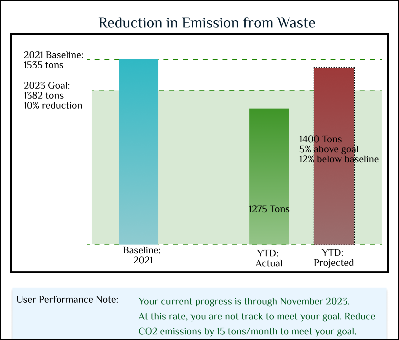
Set and track identified waste goals: Waste Diversion, Waste Reduction and Reduction in emissions from Waste
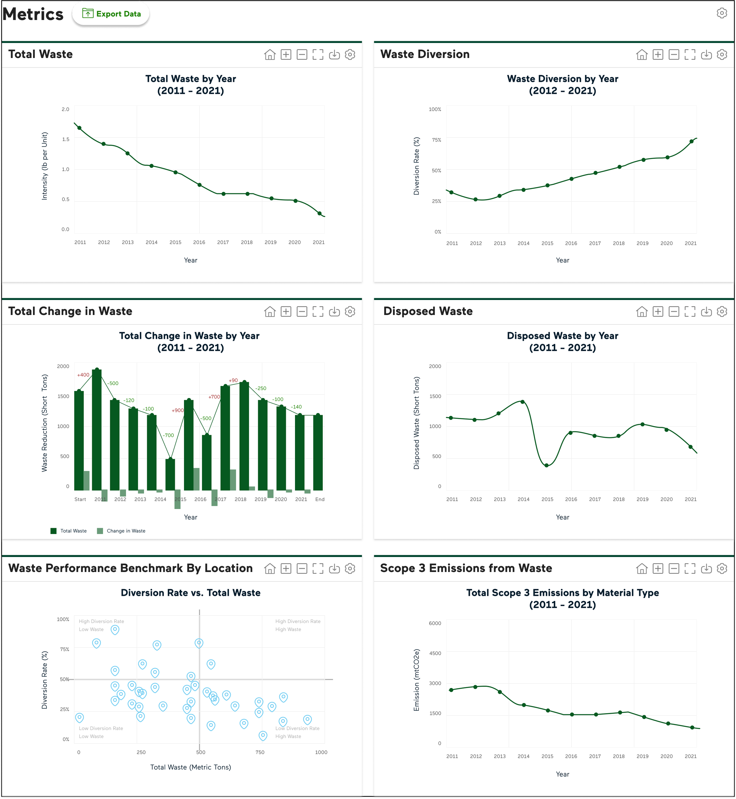
View trends in Total Waste, Change in Waste, Waste Diversion, Disposed Waste and Emissions from Waste over the years for all generated waste materials and treatment methods
View unit wise performance to scale organizational progress
Access waste management performance reports for audit purpose
Showcase impacts of waste trade activities
Customer Pain-points
Calculation of most suitable and realistic waste management goals
Consistency and reliability of all waste data used for calculation of goals and index parameters
Definition of organizational strata for efficient waste monitoring
No set uniformity in organizational units’ record keeping
No prior experience of comprehensive organizational waste regulation control and management tracker
My Impact Dashboard Design
Dashboard Home
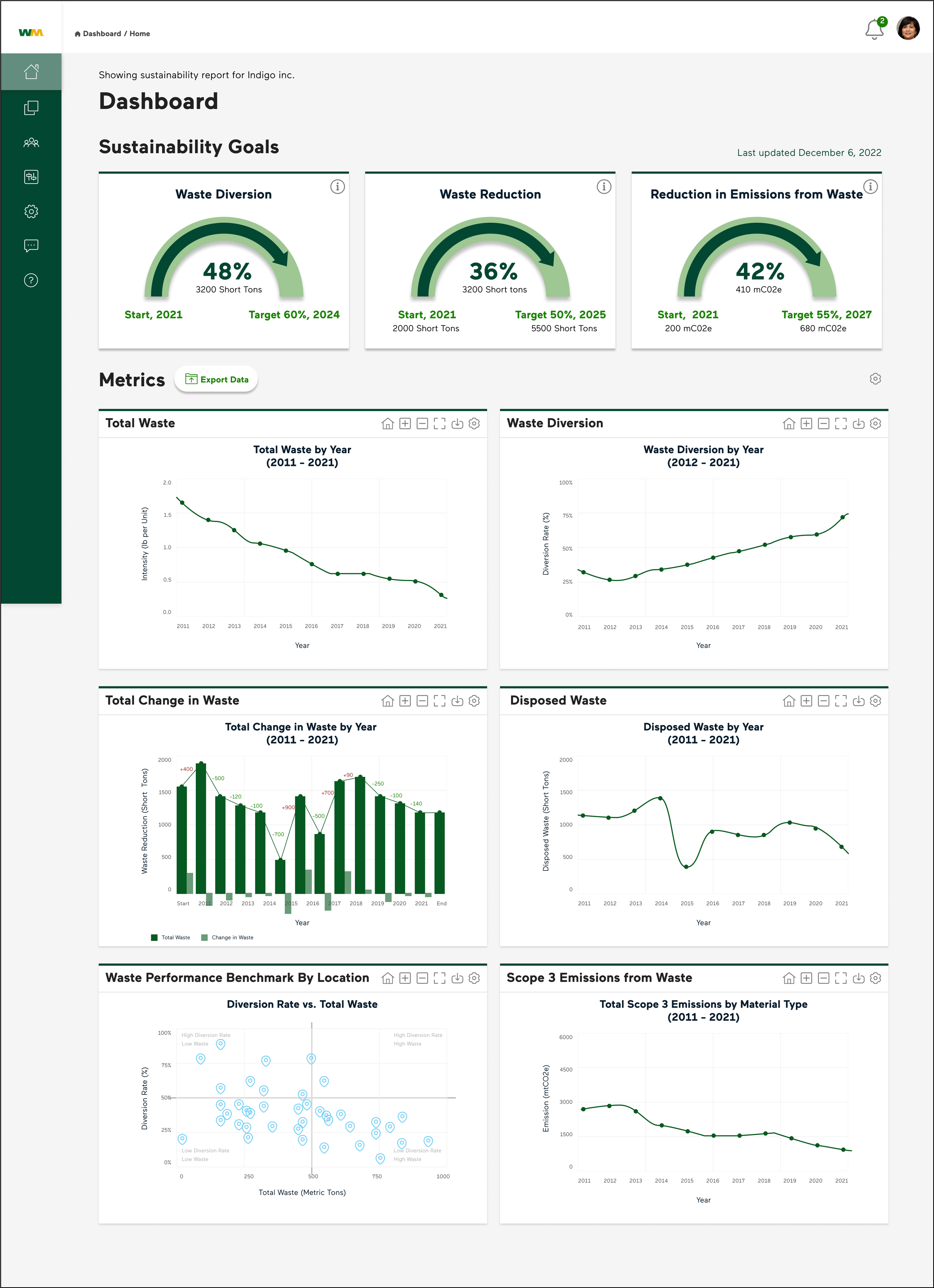
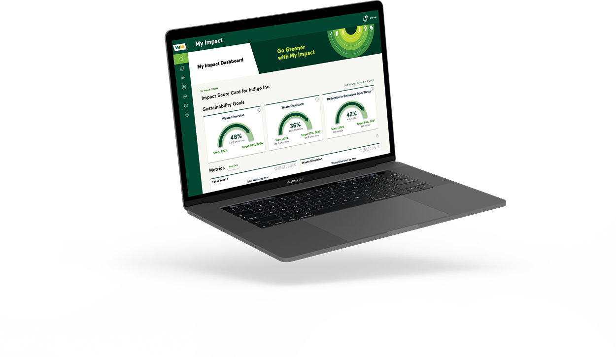
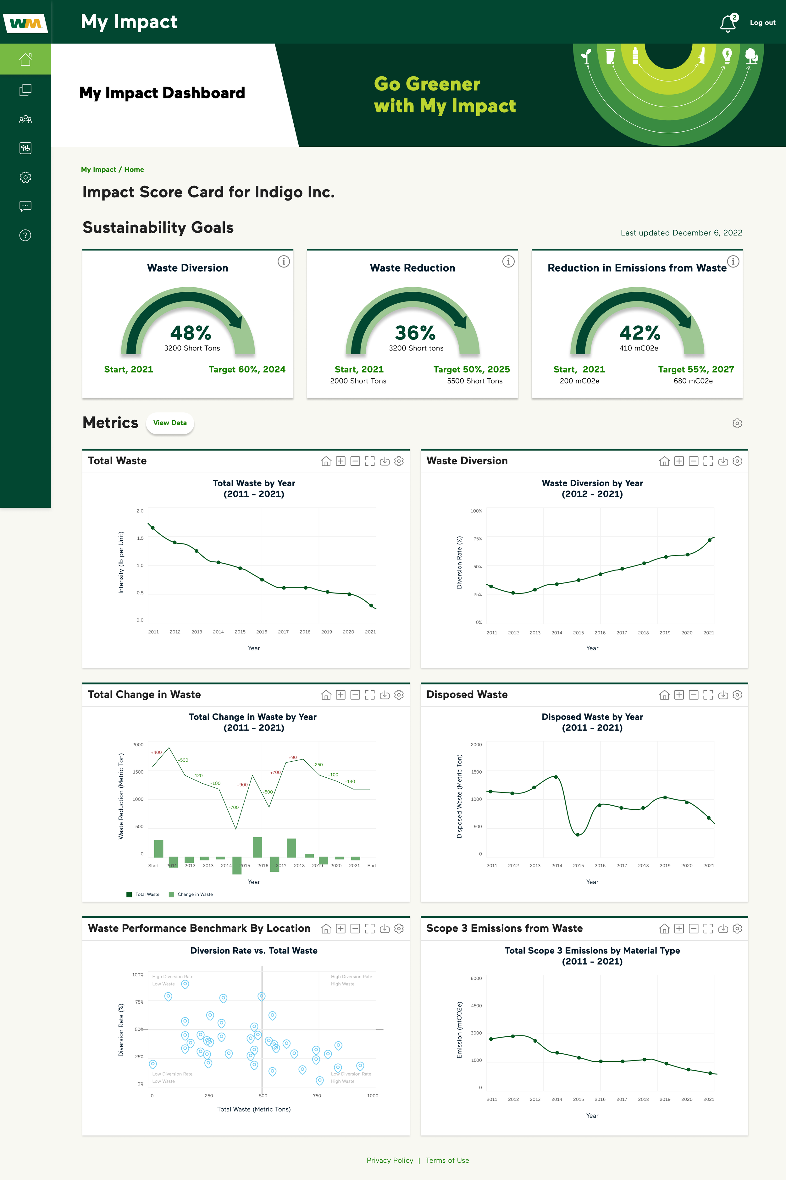
Monitoring commercial waste generation and tackling it could be best achieved through a visual representation of the companies waste metrics on a dashboard, a consensus commonly agreed by business and consumers alike. So WM My Impact was designed as a web application that provides the users to view their waste profile in a dashboard mode showcasing their set waste management goals as well as their performance on essential waste index parameters over a time range.
Real-Time Sustainability Goals Tracking
Organizations would like to monitor as how well they are performing in terms of waste reduction and regulation so as to contribute towards conscious environment health improvisation, which is necessary on their part in current times when increasing human population has impacted towards an increased manufacturing, involvement, resources consumption and use of land.
To keep organization on track of significant waste management, the key goals they would like to track or check their progress were identified as ‘Waste Diversion,’ ‘Waste Reduction’ and ‘Reduction in Emissions from Waste.’ These goals are selected based on consumers’ demand, audit purpose and nature of waste data aggregated for analysis in accordance of consumers’ voting to meet their waste management requirements.
Representation of Goals and Progress Tracking
Multiple iterations for the identified goals were created with the aim to achieve visual distinction, showcase performance in motion and provide a clear picture of users’ set target and timeline.
Help
Filters
Downloads
A half-speedometer/gauge method of representation to indicate motion: arrow shows current progress; start and end period and set target also shown in each goal section.

Speedometer with bar chart: arrow shows current progress with performance tracked over the years. Current achievement is indicative of the the target percentage.
Concentric progress and set target in a circle with percentage achieved as current performance with a ‘time to finish’ approach. Users can view an elaborated statement of real density of waste activity as ‘task to perform.’
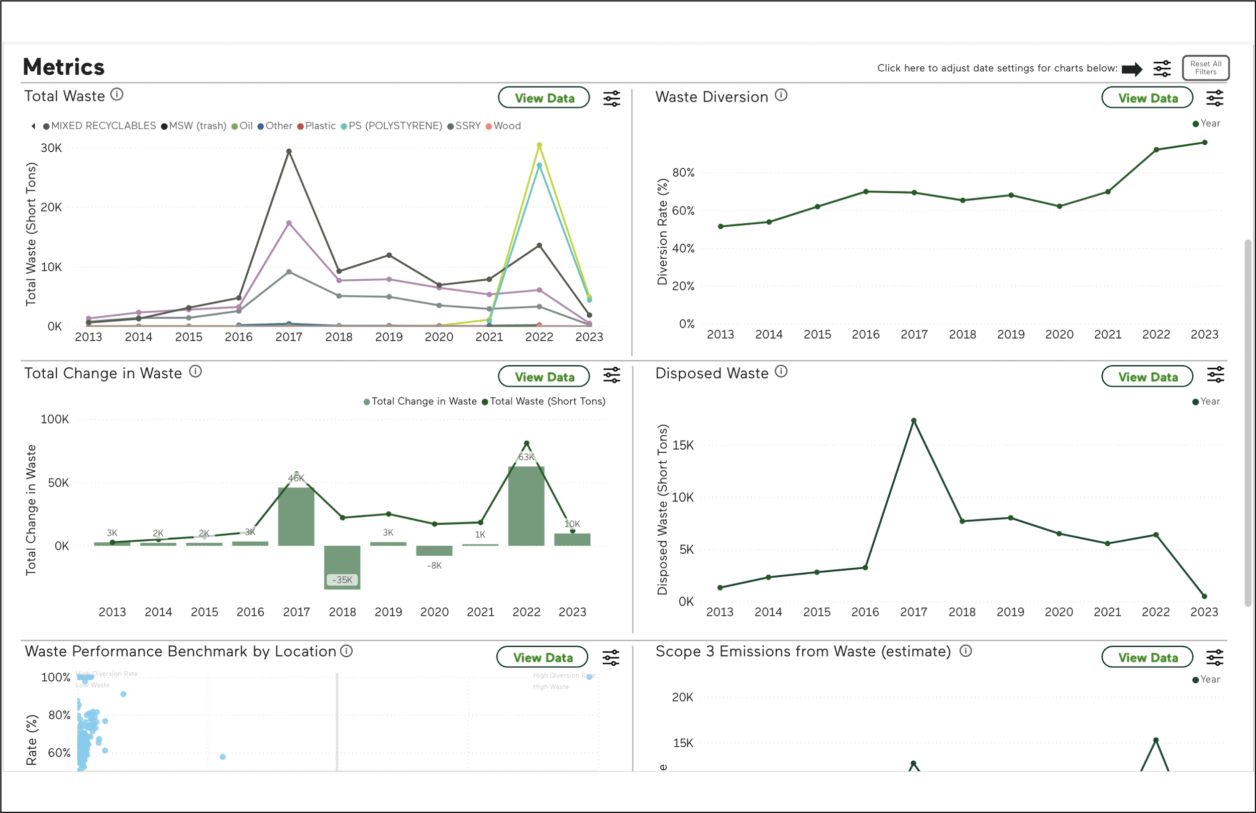
Data-supported Visual Metrics
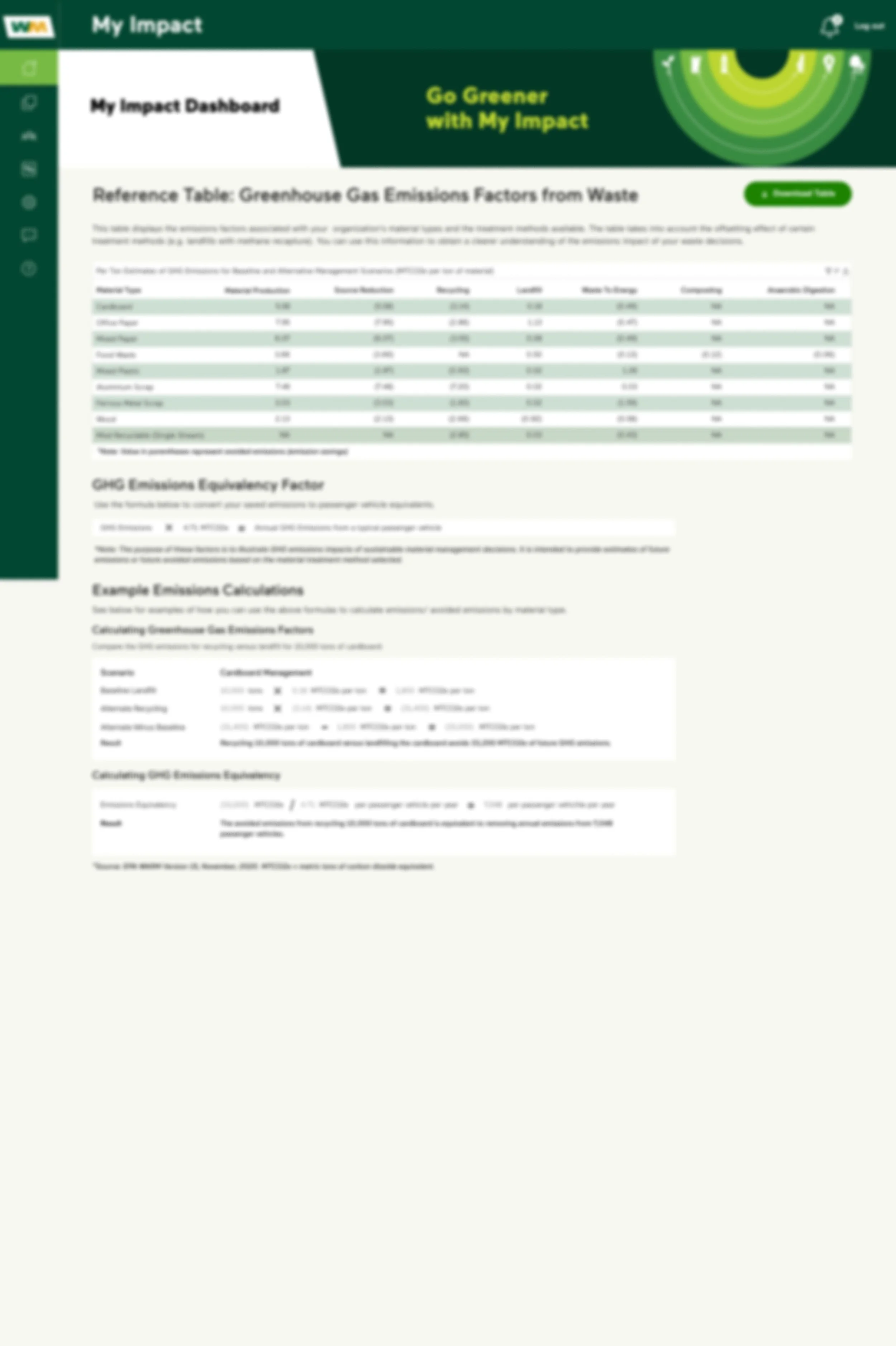
Data driven representation of the organization’s waste activity is displayed as individual quadrants as a graph with relevant identifiers on x and y axis. The data is derived from the ETL extraction and centralized database storage to avoid ambiguity. This section of the dashboard was design in alignment with Power BI feasibility of plot generation to support web application.
Sectional Representation: Bars and Lines
Users have the ability to set their preferred method of view: bars or graphs in accordance with Variables and Data range they want to see on the plot view. The default line and bar graph view is set based on ease of activity tracking related to the waste parameter in analysis.
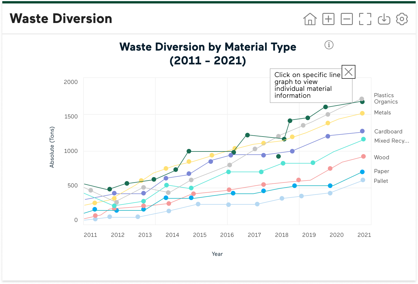
Material-wise Reporting
Accessibility
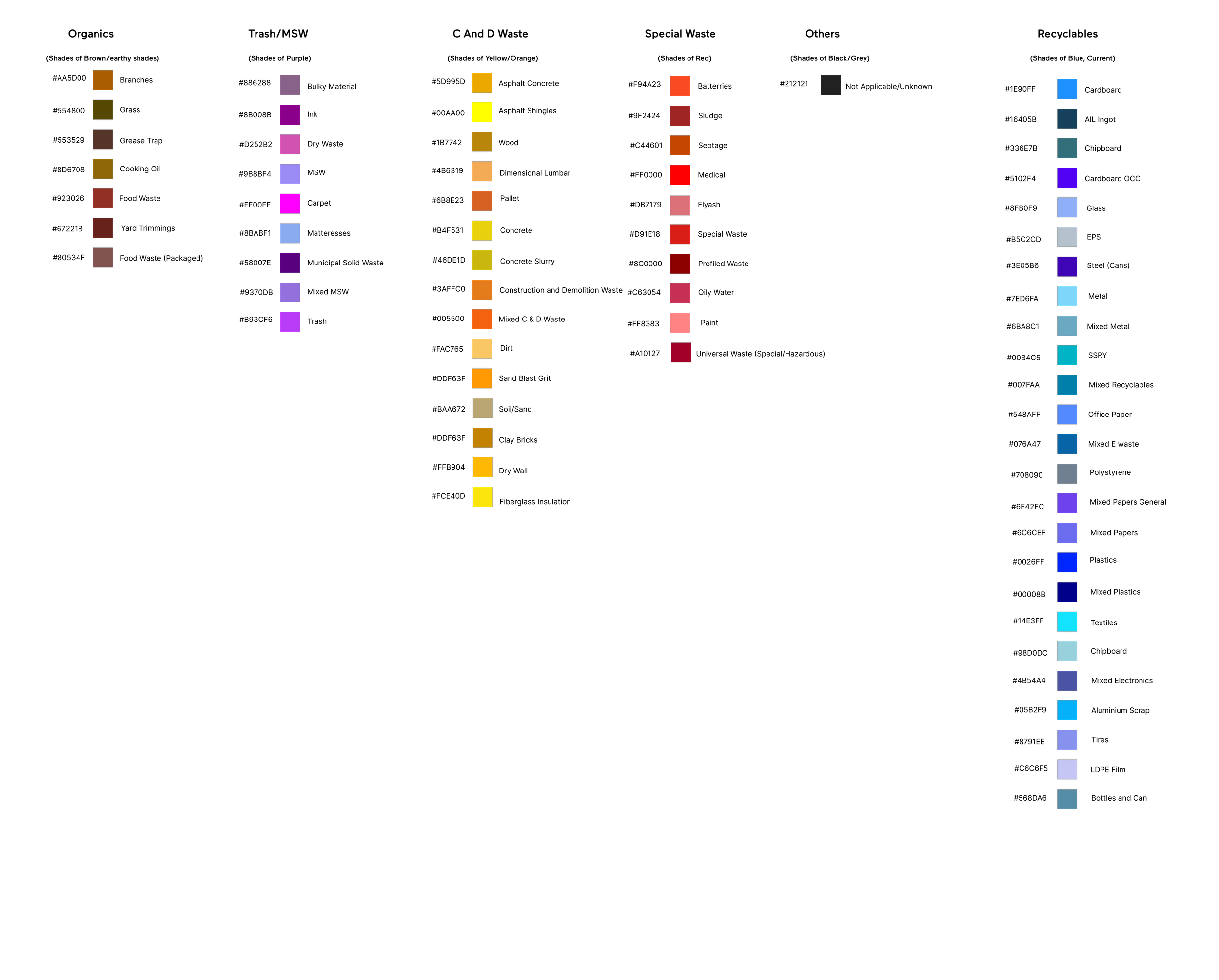
Creation of a waste profile for organizations led us to compose an exclusive list of comprehensive materials that are part of the generated waste from their business activities. The users were interested to track these materials and the way they are dealt, so that they can address them individually if any particular materials were of greater concern than the rest. These materials were categorized into six major waste categories as ‘organics,’ ‘Trash/MSW,’ ‘Construction and Demolition’ (C and D), ‘Recyclable’ and ‘Others.’ To maintain uniformity in reporting and plot representation across the dashboard platform, a specific color shade (Hex code) was allocated to each of the material under each material family. The same color code was used for Power BI graphs for the material wise graphs.
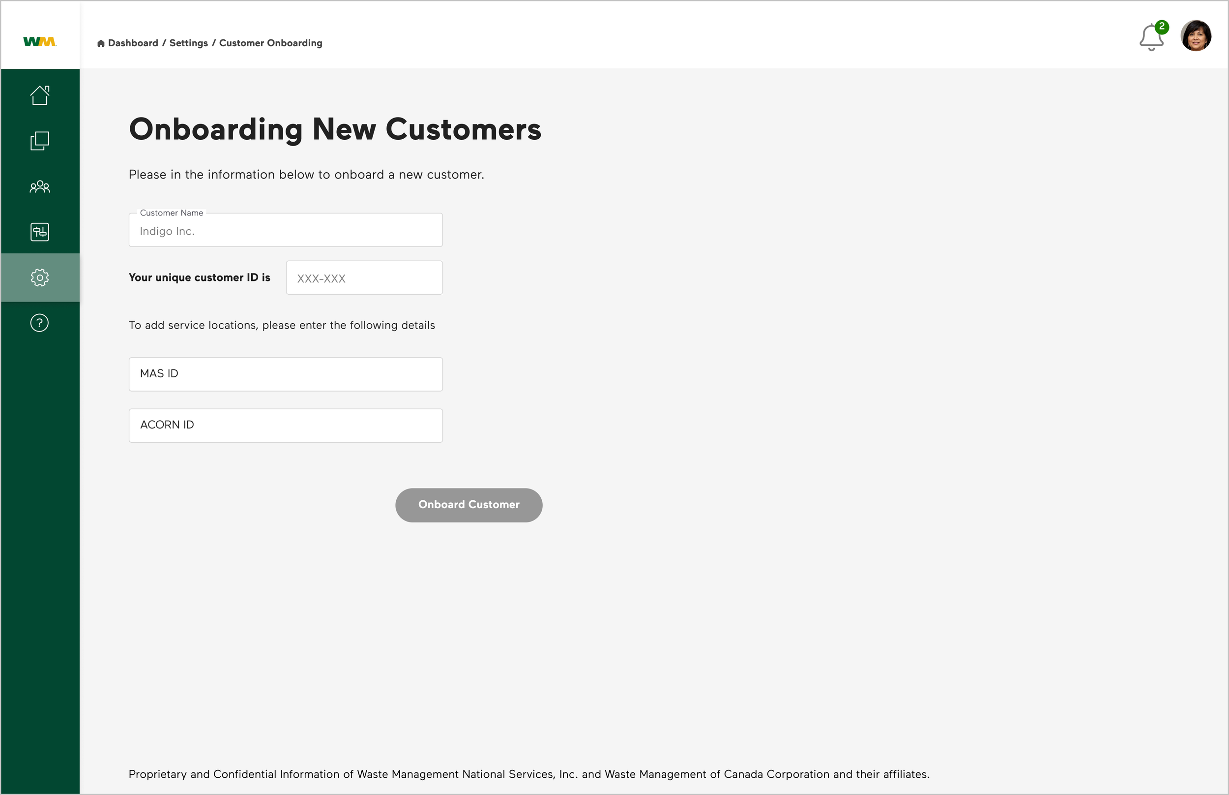
Customer Onboarding
Onboarding any new customer to My Impact Application would require the incoming users to sync account with existing database account ID for the system to fetch their waste activity data. So users are asked to enter their existing database ID into the onboarding form provided.
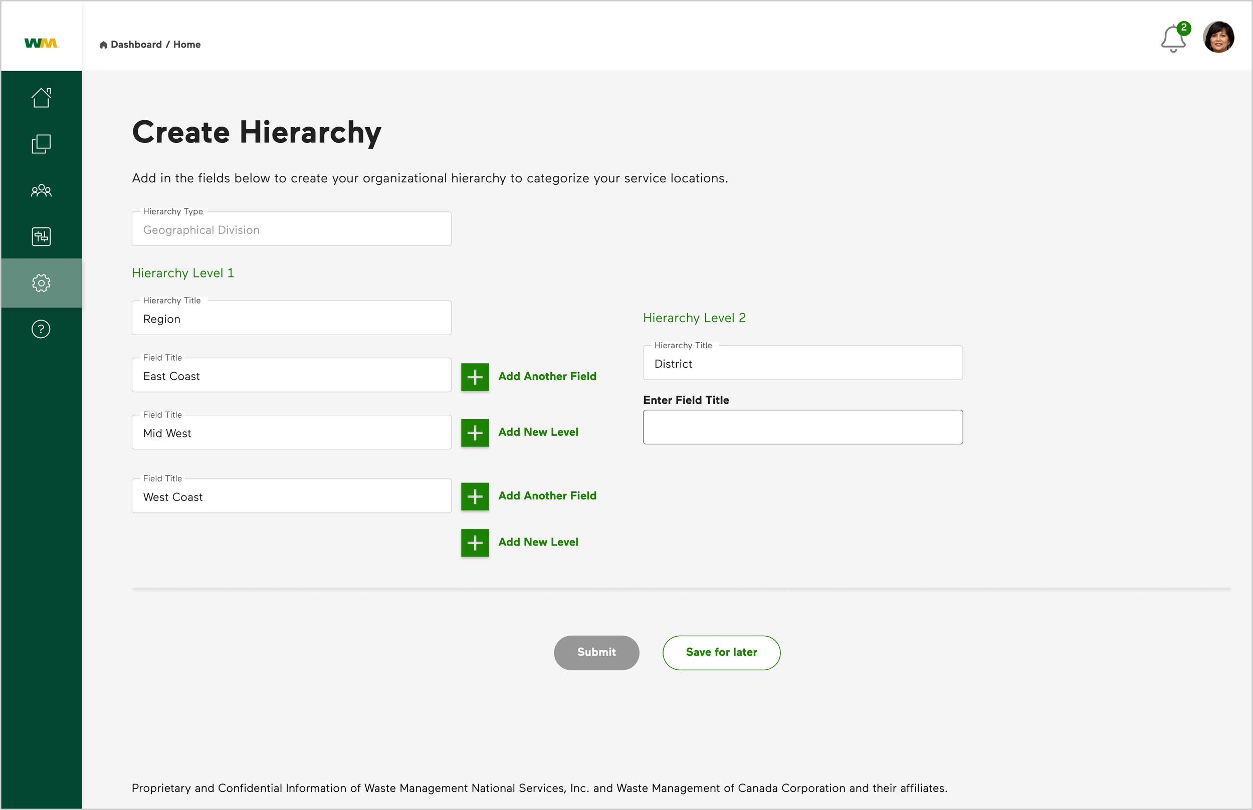
Once onboarded/registered to WM My impact Application, customers are asked to either configure their organizational hierarchy or manage operations locations that they would like to be monitored for waste management performance.
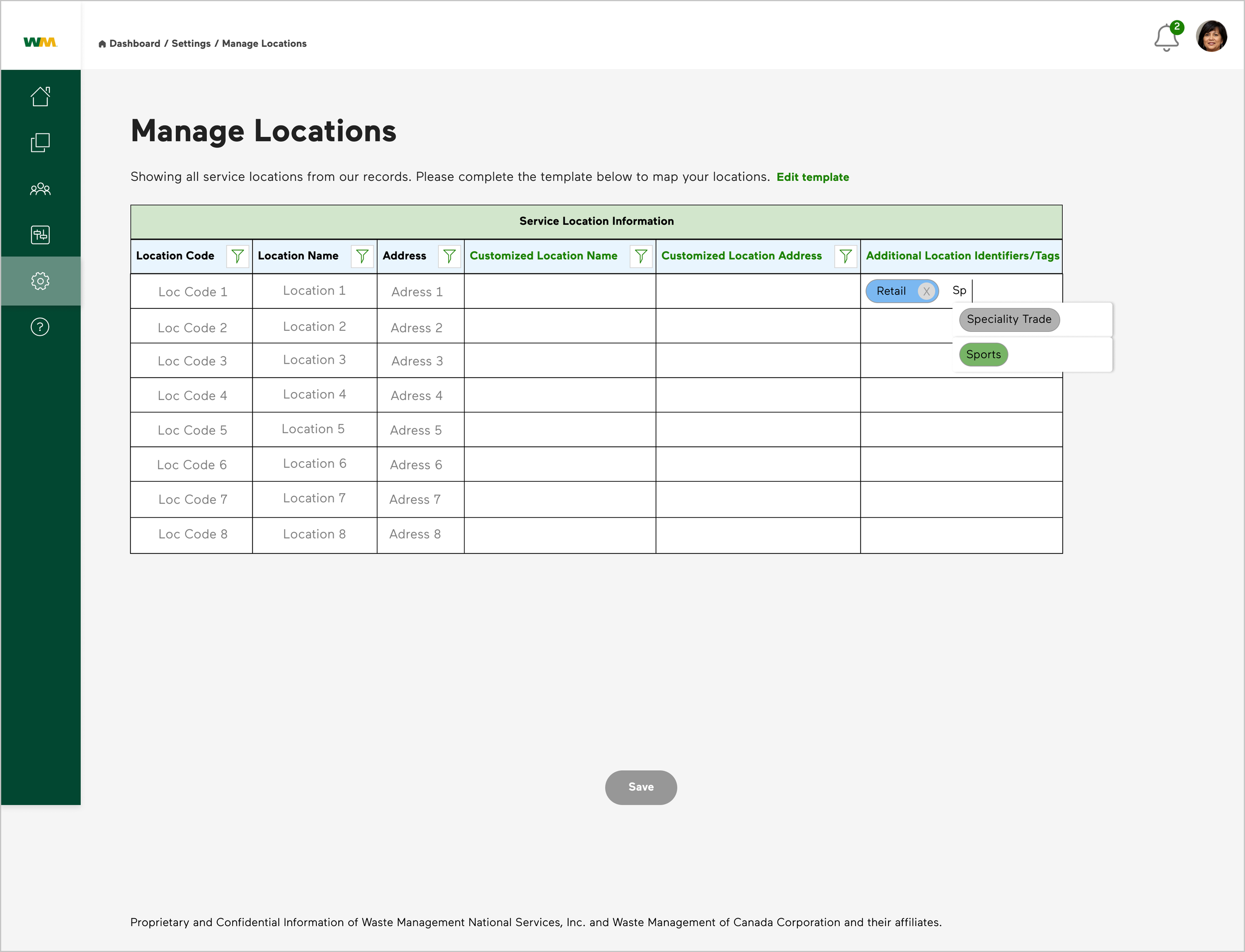
Managing Locations
Setting Customer Hierarchy
Organization-specific waste material profile is built with listing of all composites of the waste that they produce such as Plastics, Paper, Cardboard, Wood, Concrete, etc. varying with nature of operational/business activity. Users are provided ability to track material specific waste parameter such as ‘Waste Diversion’ as a ‘uni-track’ or ‘combo-track’ with a simple ‘click and add’ and ‘reset.’
The selected color code was tested to qualify on the grounds of accessibility and ability to create enough contrast as to differentiate different materials when displayed together. It was adapted to Power BI reports as shown in the Image in Left and assessed real time for customer feedbacks.
Users can download all of the plots/graphs, tables and other data representations and use it according to their audit or performance reports requirements.
My Impact Application allows users to create their organization hierarchy with the purpose to let them define the organizational strata themselves which will help the database store information in a level well-defined by the customer themselves, avoiding confusions and setting up monitoring authority for their own scrutinization purposes as well as keep the information updated for data pulling.
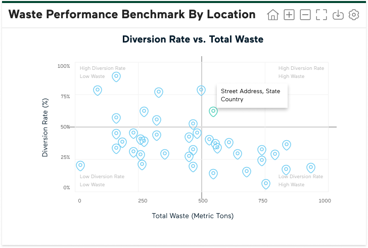
Once the locations are recorded for monitoring, the customers can view them auto-populated in the performance quadrant for inter-location comparison for performance benchmarking. The quadrant reflects zoning of the units/facilities into having ‘High Waste Diversion Rate-Low Waste’ as best performers and ‘Low Waste Diversion Rate-High Waste’ as the least performers. Users can hover on the the particular location icon to get the specific address for the respective unit/facility.
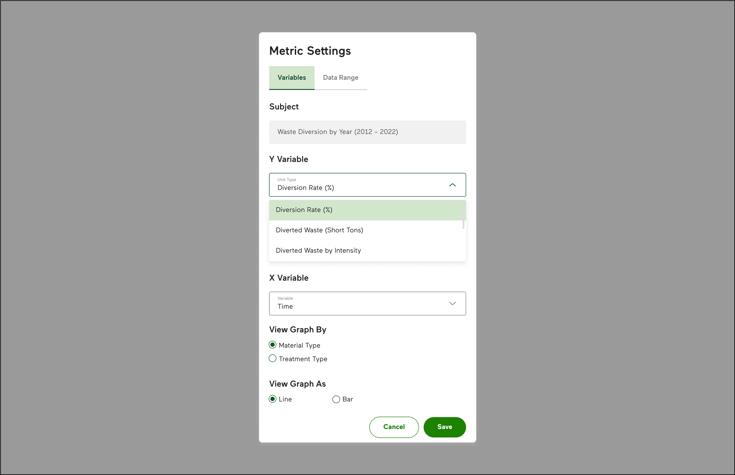
Users have the ability to filter the tracked waste parameters in a ‘Metric Setting’ with option to select x and y axis variables as variations in nature of time period and quantifications as rate, real weights or intensity, view by materials or treatment methods as well as switch between line and graph plots and set data range for the same.
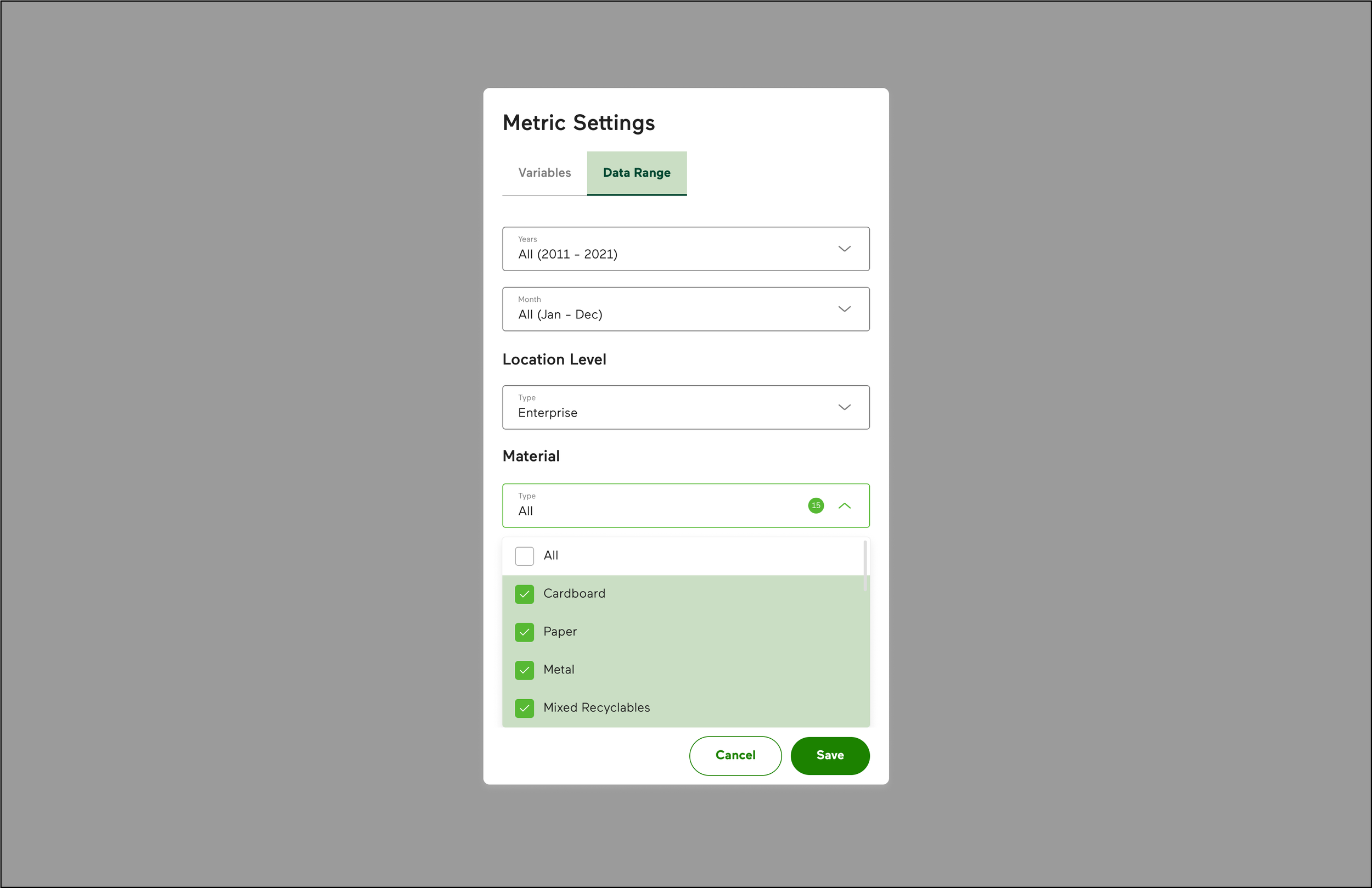
Filter by Data Range

Users can view their account information, see associated organizational accounts, types of roles and activity status and even create group membership based on common authority. Admin users have additional ability to onboard other users for a specific organizational account, delete or add roles to existing users. Super users can subside on Admin user activity and can even switch between multiple organizational accounts assigned to them. This varied levels of user profile is created based on supervision or management activity they are allotted which can precisely be distributed as application platform management, organizational management and general users.

Manage locations let the users add customized location name, address and business line as identifiers to add up to their locations in WM database records. This enables the user to verify their list of locations and type of businesses to make sure the waste activities data is pulled efficiently. Once ‘saved’ the recorded locations are populated automatically on the performance quadrant for tracking their execution fulfillment towards achievement of organizational waste management goals.

Performance Quadrant for all listed Business Locations for an Organizations

Users are provided a free form to build their operational hierarchy with the ability to add in new levels and fields at subsequent inputs until they create desirable hierarchies, which is visible to them in a tree-branch visual representation for utmost reference and ensure them that the data references used for monitoring are accurate.
User Profiles and Permission

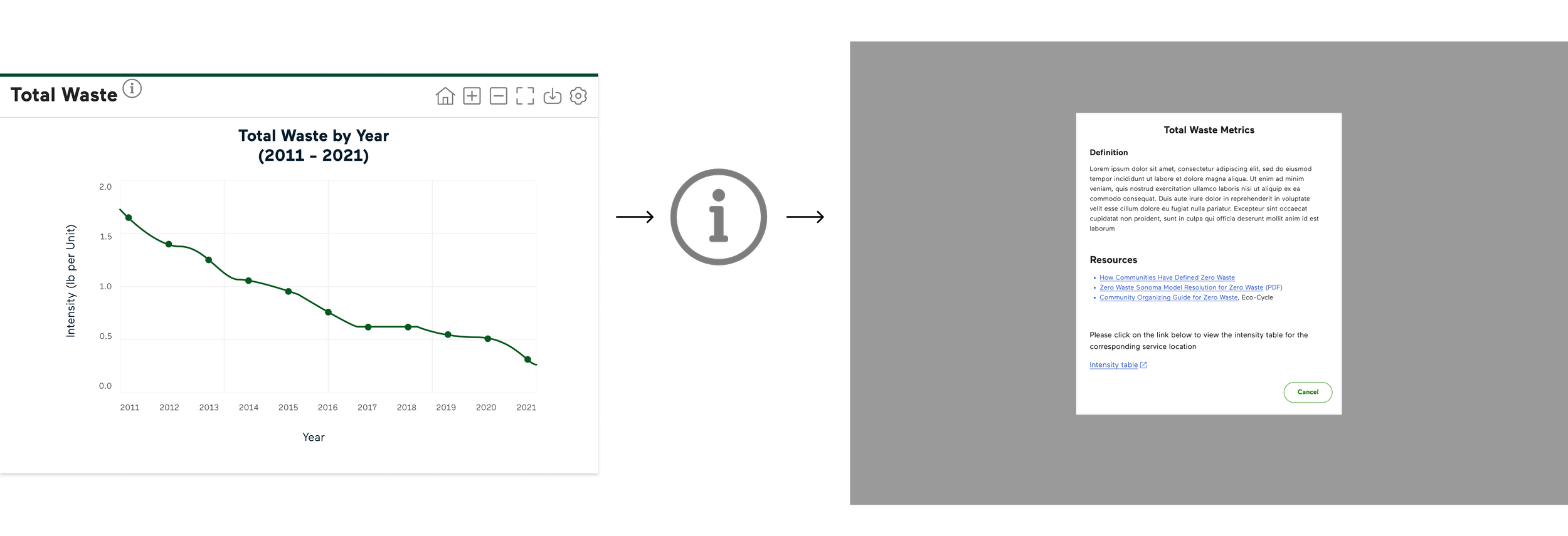
User Assistance: Help, Filter and Downloads
The help icon associated with the text headers on the dashboard components extend to detailed information upon ‘click.’ This provided the users to educate themselves about the content and representation. They are also entitled access to the data table acting as the source for the activity plot as well as other resources for an enhanced knowledge about the topic.
Filter by Variables
User Acceptance/Validation
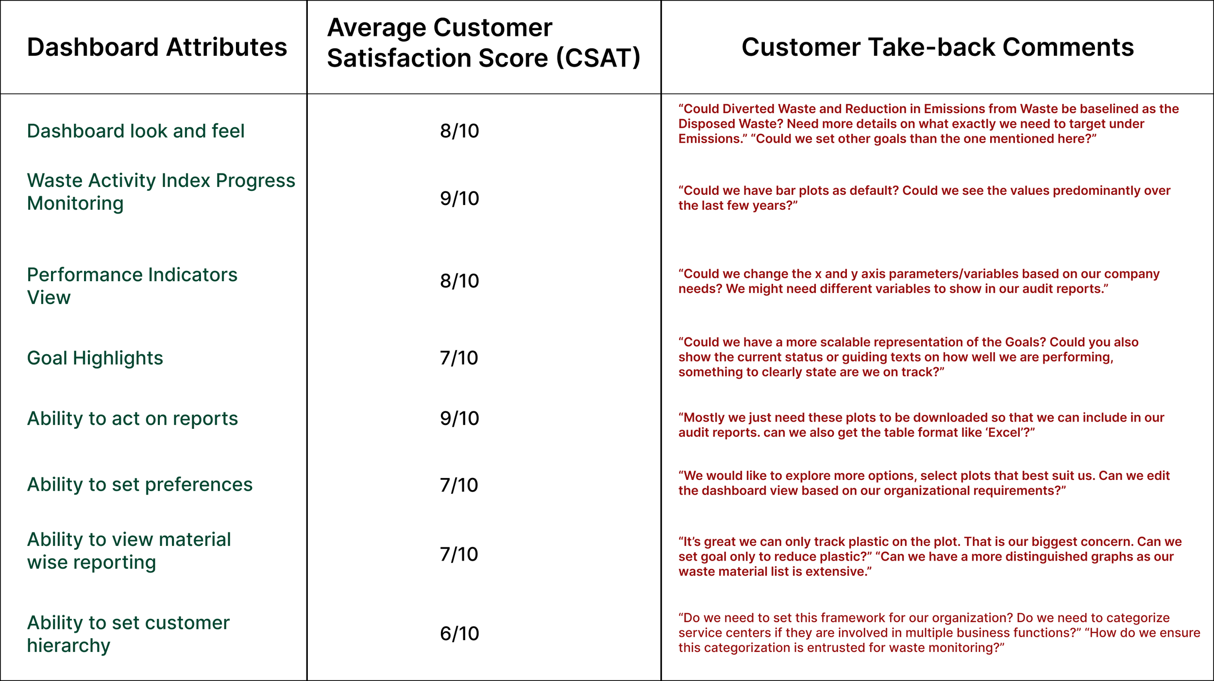
‘My Impact’ Dashboard was targeted for a viable MVP that could be adapted by the primary set of recognized (existing WM Customers) users. We adopted a ‘feature-to-feature’ feedback or validation of the dashboard section in a focussed-moderated user testing session.
The ‘gauge’ method of waste goals representation had maximum number of users consent with 90% ‘go’ from all lighthouse customers. Customers expressed ‘delight’ to be able to track material-wise waste activities through the plots, which was a major follow-up concern for event organizing businesses like stadiums.
‘Reduction in Emission in waste’ was identified as the goal subjected to more analysis as many customers, like a few public services like libraries, construction and demolition businesses, required more elaboration and understanding as they could not relate to data potency and efficacy of reduction in emissions tracking towards waste minimization goals.
Due to difference in the apprehension and concept of the three displayed ‘Waste management Goals,’ an uniform representation of their progress was a concern raised by some customers, particularly considering their similar source baselining.
Below, is a consolidated user score on the Dashboard Design from the post-testing follow-up and feedback session.
Take-aways for Design iterations
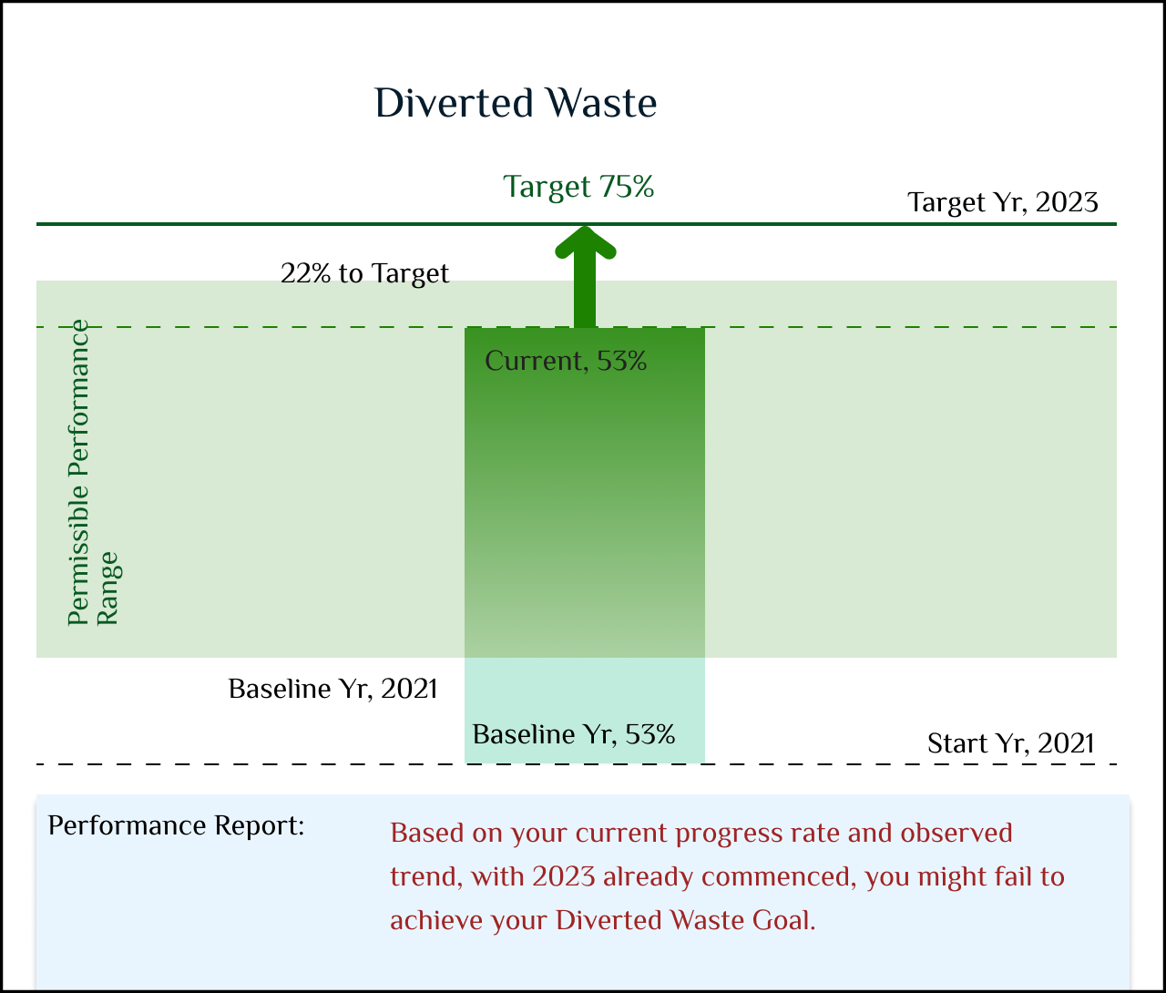
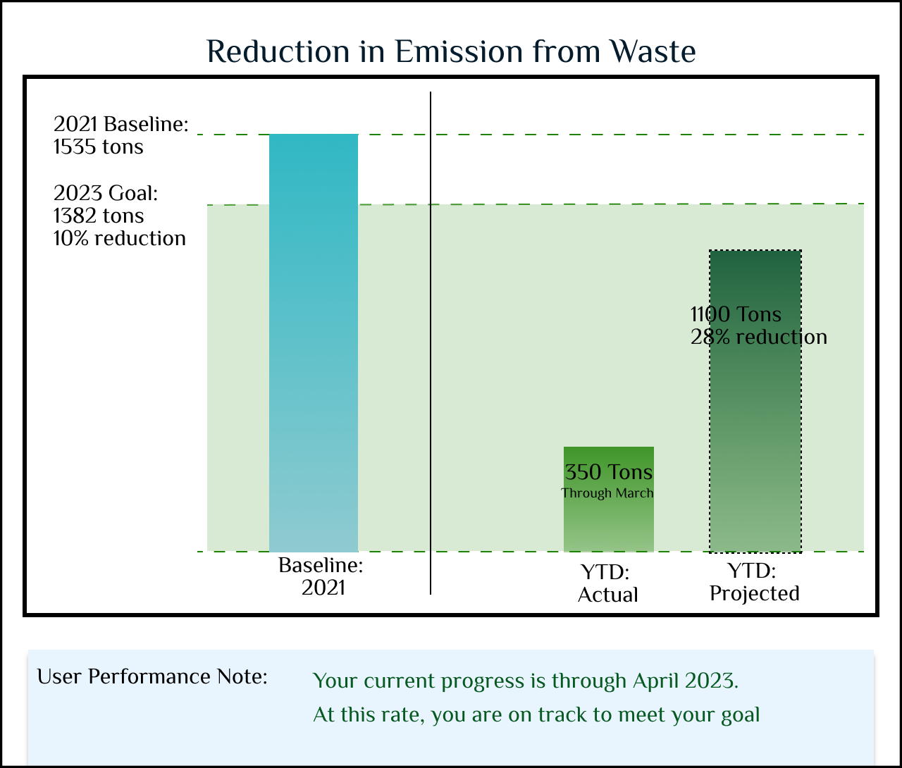
Goals Representation Re-design
As the nature of waste goals vary according to their definition, I have tried to re-imagine their representations with more emphasis on a clear display of baselines, start and end year, current customer position and guidance for the users to predict their upcoming performance: whether they would be able to achieve their target in the dedicated timelines.
The image references shown here demonstrate alternated representation for Diverted waste and Reduction in Emission from Waste in both a lead and lag scenario.

Re-design Customer Onboarding form with Third Party services information for accurate numbers on the plots
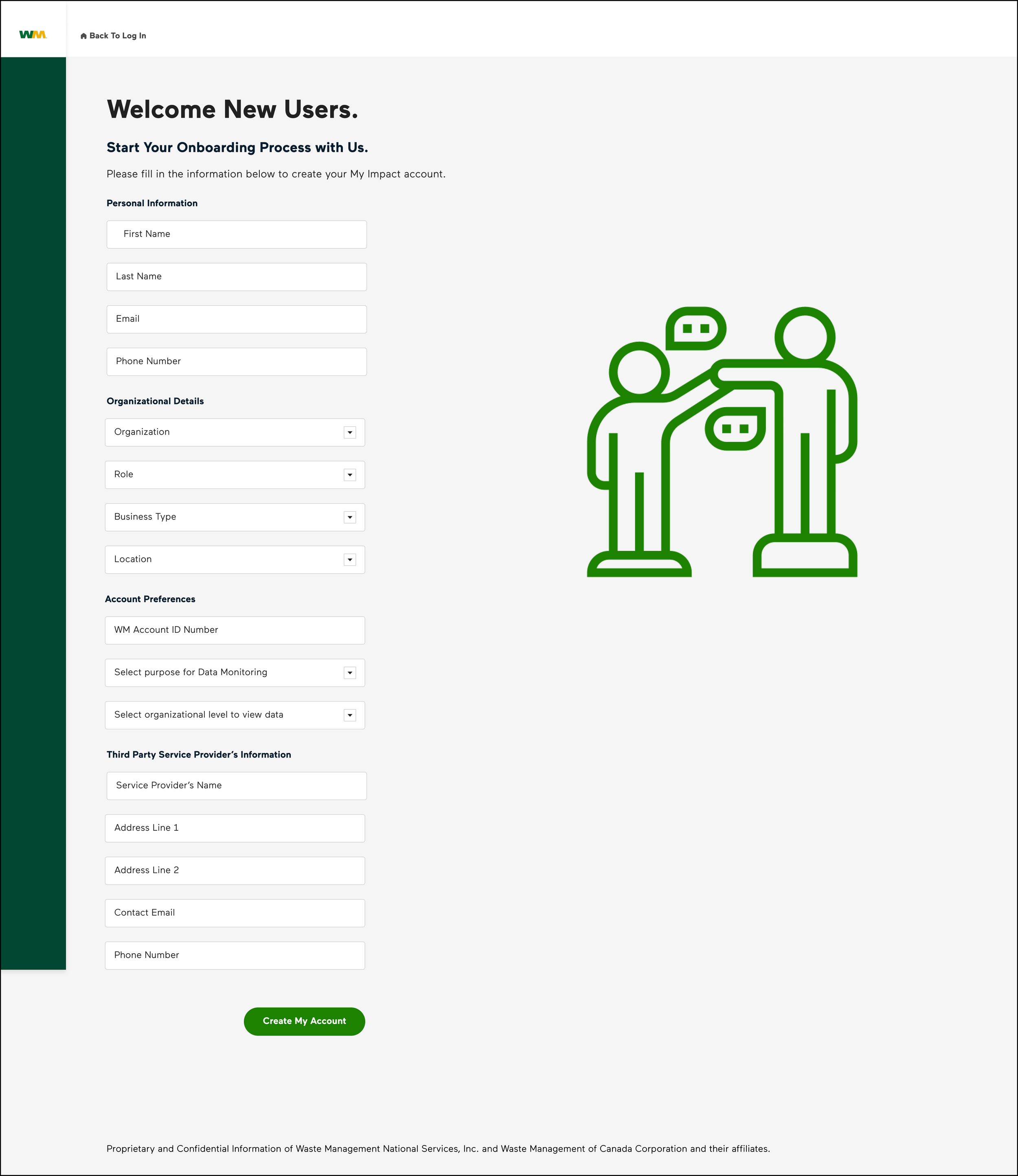
I have re-designed the customer onboarding form for new users with additional information details such as instead of their MAS and ACORN (database) references, they can enter their WM Account ID for an effortless registration. They have the provision to enter the details of any third party service provider, who operates waste related activity for them, so that application receives the accurate waste activity data to show the organization’s performance on the dashboard
Customer Hierarchy: Interactive Business Line and location Blueprint Build
Customer Hierarchy form has been re-designed to make it more intuitive and smoother experience with determination of nature of business from NAICS code. The customer then get auto-populated ‘Line of Business’ as well as ‘Function of Business,’ though editable from a list of drop downs. They can also allocate units/service centers/facilities to those combinations from the scrollable list of ‘Service Locations.’ Users can add on as many Business line combinations they desire, to be recorded for Waste Management activities.

Platform: Desktop
Tools: Figma, Power BI, Zeplin, Miro, Keynote, MS Word, Confluence
Methods: User research- Contextual Enquiry, Interviews, Surveys, Journey Mapping, Data Analytics
Prototype Build- User Flows, Card Sorting, Wireframes, Hi-fidelity prototypes, Screen flows
User Testing- Remote Moderated testing, Customer Feedback, Concept Testing, Heuristic Evaluation, A/B
Testing, Tree Testing