Only Village
Today's health conscious urban consumers who are at a constant lookout for organic-unadulterated grocery produce to be used in their kitchens, find it difficult to procure authentic and desirable food items conveniently to be delivered at their doorsteps on a regular basis and in required quantity.
Only Village is an online organic farm produce e-commerce start up, based in Pune, India, dedicated to deliver authentic and healthy traditional products from Farm-To-Table. The project tends to revive the existing features of the current website for a more refined and professional experience and in turn lead to successful conversions.
Design Goals
A re-design of the existing features of the current website for a more refined and professional experience through responsive web design with identification of key motivating factors that encourage users to shop authentic, organic and native Indian traditional food products online through ‘Only Village.com,’ resulting in successful conversions
User Research Insights
Understanding of the target users needs and goals
To find the key motivating factors for users to shop 'Only Village' products online
Formulate design solution for successful conversion
Defining Business Goals
Motivate an extensive user group to purchase 'Only Village' products online
Inspire customers to switch to traditional organic Indian farm produces
Promote easy accessibility across the platform for higher conversion rate
Defining User Goals
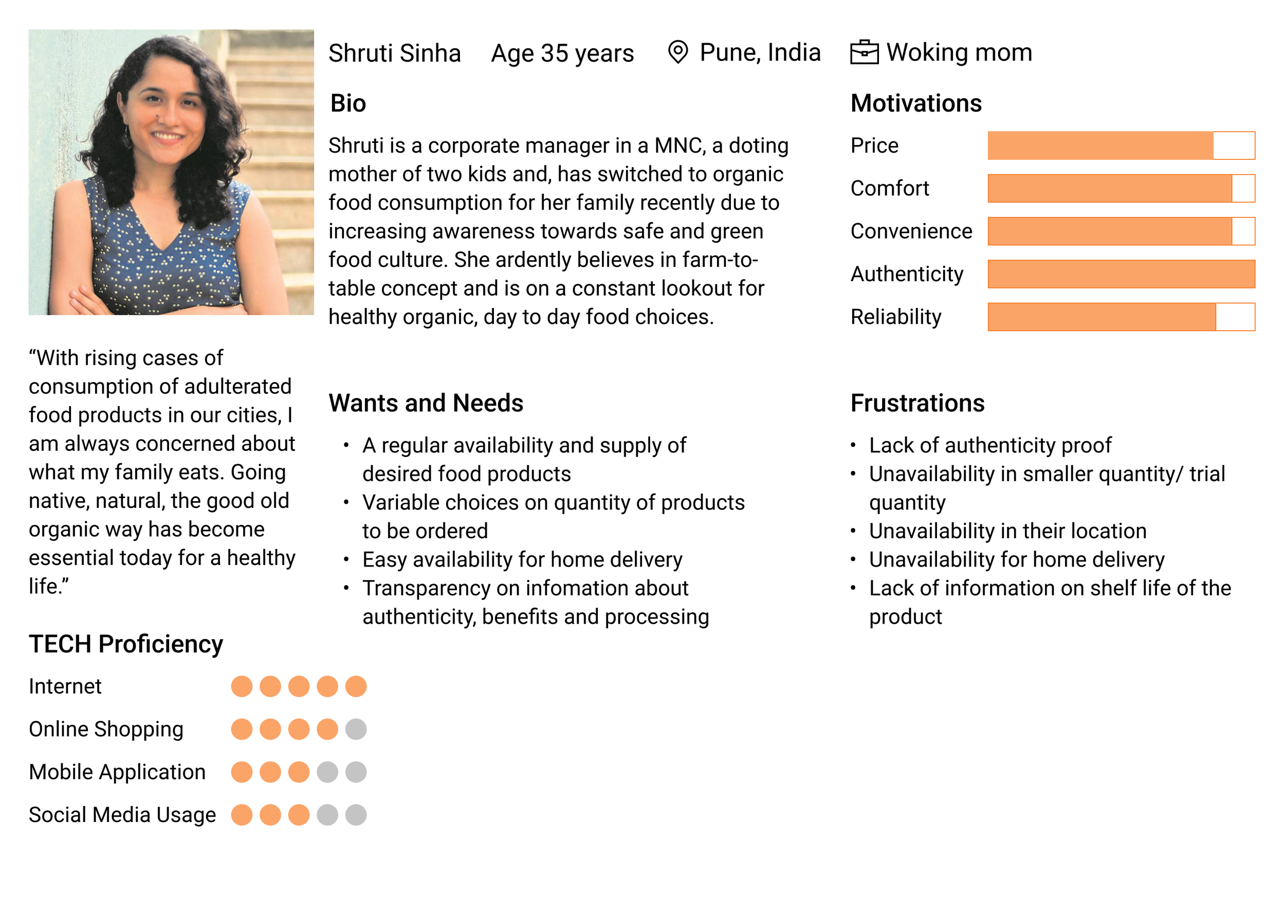
To know the users and their aspirations from the business, their current activity and alternative retorts. This presented a deep insight of user needs, goals and pain points. It started with a survey questionnaire followed by a more narrowed down user interview with 8 different users.
Defining Target Users: User Persona
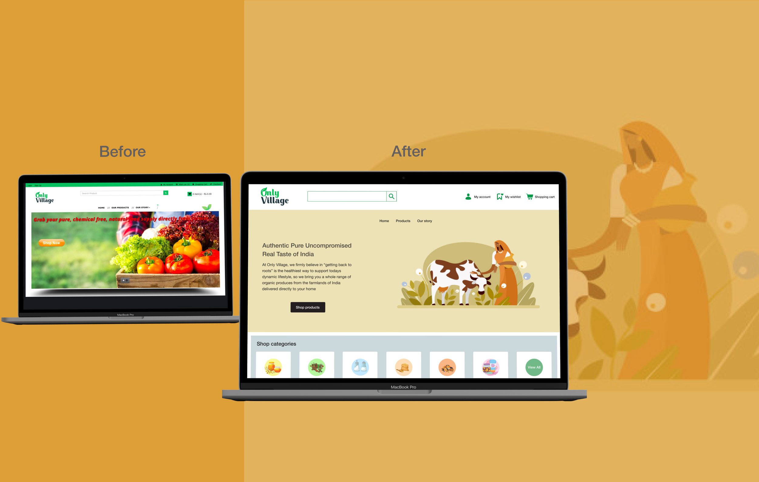
Only Village Web Design
Determination of User Pain-points with existing website
A task oriented user testing session was conducted with these users to identify design loopholes in the current website.

Image summarizes Users' experience with the original product
Keeping in view the outcomes of the research, the major glitches identified were:
Extensive motion displays on the landing page distract users from buying intended products and exploring required categories
No indication of 'pending cart items' or 'proceed to checkout' on the cart icon. Instead users get confused with separate 'Cart' and Check Out' option
No refinement in content arrangement and lack of hierarchy decreases visual appeal among users
Lack of information on product quantity, type, availability and poorly incorporated 'Call to Action' (CTAs) buttons made user action drop significantly in between the process of product purchase
Potential solutions that addressed the above concerns based on priority were identified as:
Hero section with clear business provisions to the users
Content selection and arrangement based on user needs and goals
Refinement in CTAs to motivate users to task completion
Accurate and most required informations about the product with 'choices of quantity selection' to match user desirability
The user flow was developed incorporating the best design solutions in consideration and the user experience was determined through the user journey mapped through low fidelity wireframes.

User flow for Onboarding and Engagement for product purchase
Product Development
Redesigned Home Page
Hero section highlights 'what the business stands for' and 'what's in-store for customers
Components are structured based on priority motivations for the users
Elimination of redundant motion for more focussed user engagement
Conservation of hierarchy and well defined 'Call-to-Action' button
Refined product's information for featured products with well directed navigations
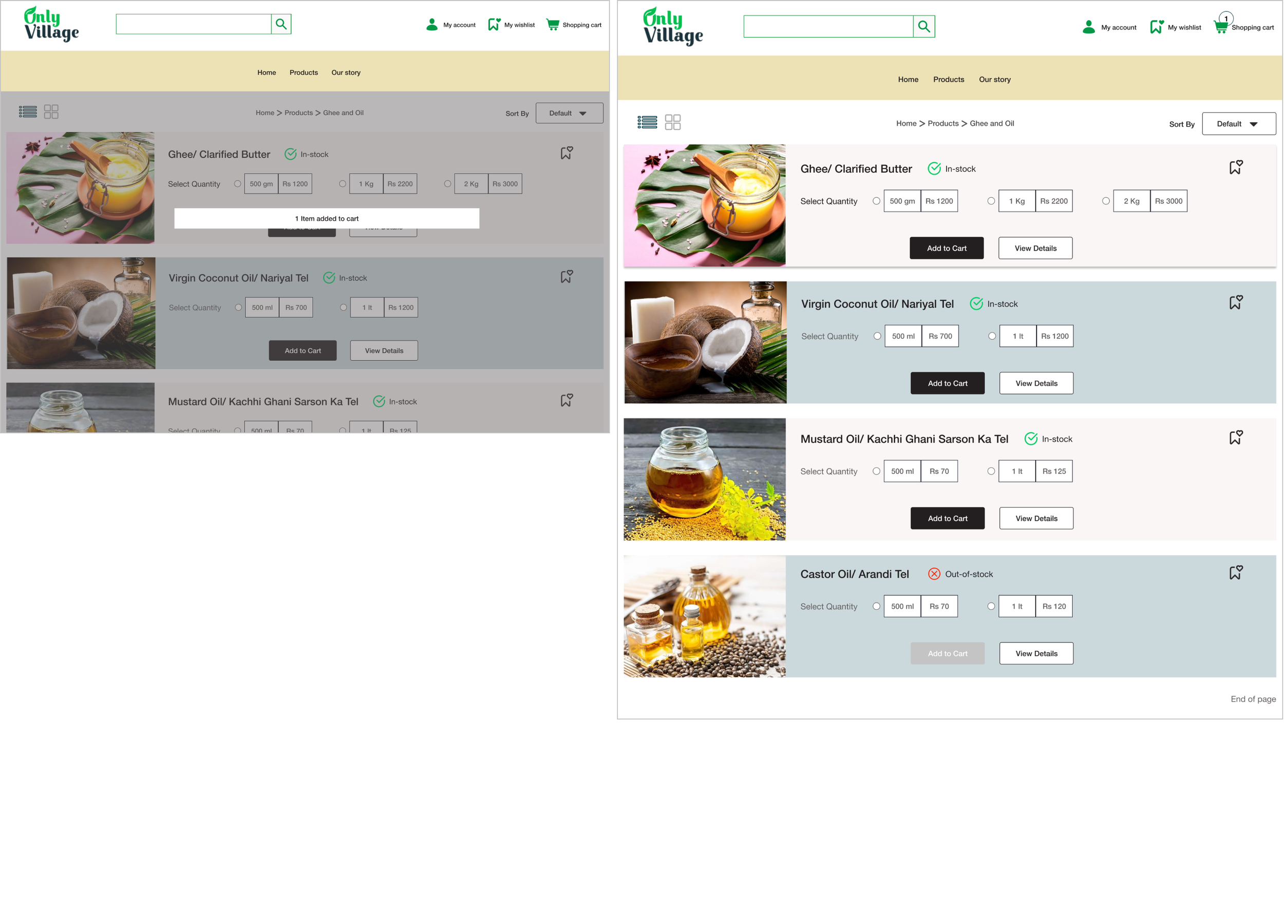
Recomposed Product Pages
'Varied options to choose from' for the users for the included products and their availability status
Options for user to 'save item to wishlist,' 'view detailed product's information' and 'add product to cart'
Navigation to detailed product information provides insight to reviews, certification as well as 'one easy click move' to other trending products
Defined Displays of User's Action
Quick notification for the user about the product added to the cart to instigate sense of accomplishment and motivate user to complete the purchase
Cart notification of number of products added to keep the user informed and drive the user towards Cart Checkout
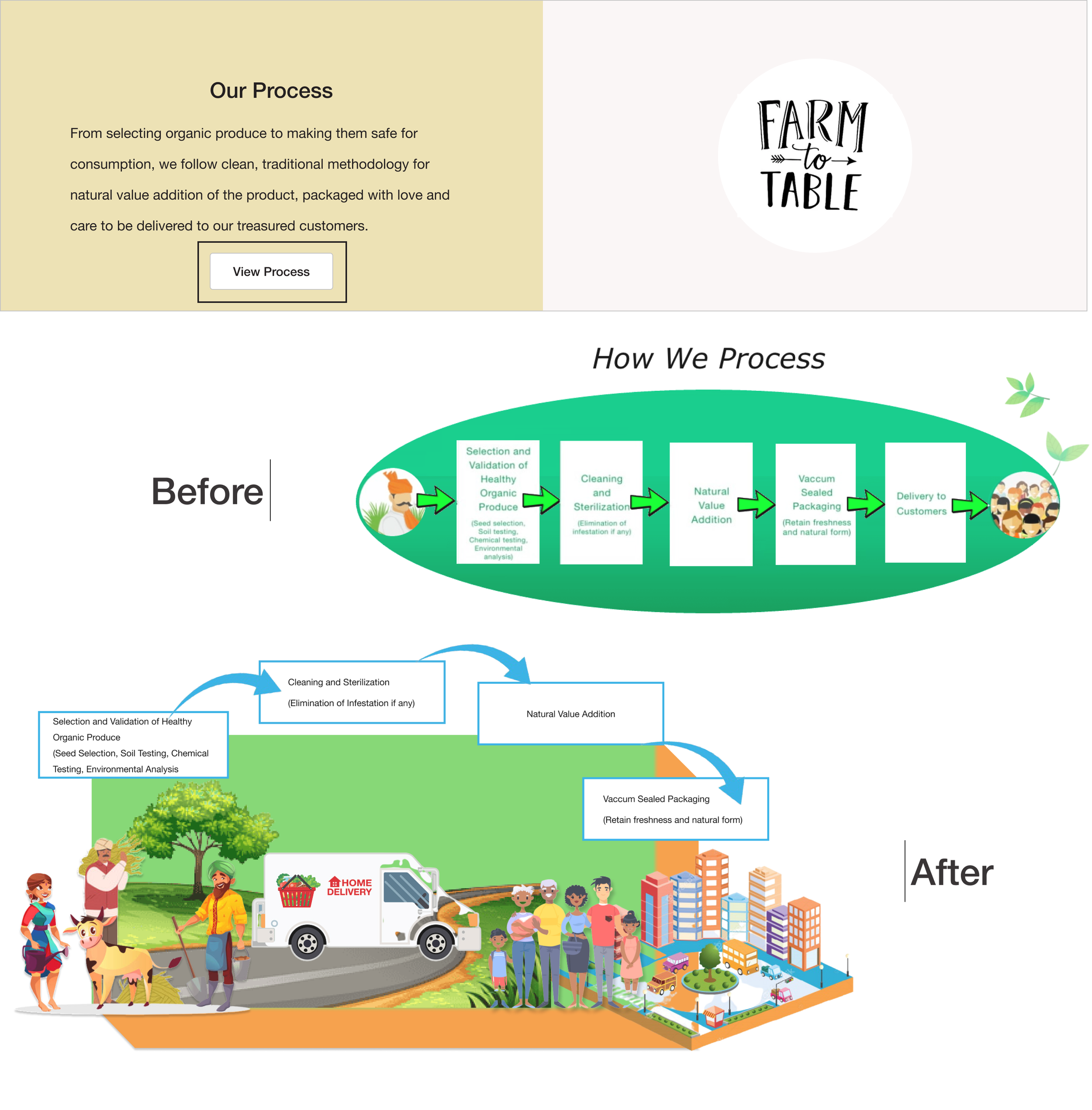
Redesigned Business Process
A 3D pop-up representation of the whole process that the business follows to get the product from 'Farm-to-Table'
Instead of persistent process description on the 'Home Page,' the process display has been turned into 'Interest based' user action


User Acceptance/Validation
The high-fidelity prototype of the revised product was tested to validate all incorporated solutions and check its impact on the overall experience the user has, whether or not it leads to successful user tasks and enhance the conversion rate.
For the testing session, I chose a mixed set of users comprising of 5 users from the research stage and 5 completely novice users for a remote moderated testing session using zoom to observe the users in action. The users were asked to perform a set of tasks in a given scenario, followed by a post-task questionnaire.

User Testing Session Evaluation (Consolidated)
During the user testing session, new users enquired of any discounts/offers the website provides on the products. This can be an important 'factor motivation' for users to buy 'Only Village' products online.
“Yes, everything seems good, but do you have any special offers or discounts on grocery items like ‘Big Basket’ or ‘Amazon Pantry’?”
There is option for adding products to 'cart' from 'wishlist,' but not for moving from 'cart' to 'wishlist.' To save an item from 'wishlist,' the users need to follow a tedious process of selecting the product and add it to wishlist from the 'product description' page.
The product was successful in eliminating all identified glitches of the existing website with properly defined hierarchy, navigation and call-to-action buttons. The time-on-task decreased significantly with enhanced product visibility observed through the user-testing session. The overall user experience with the product scored an average Net Promoter Score of 9 out of 10 and a 100% conversion rate on purchase of a given product.
Key Outcomes
Majority of users could successfully complete all the tasks with minimum effort.
The CTAs position and content hierarchy was well received by the users and lead to defined task completion for the given scenario.
A few users could not locate the 'save to wishlist' icon on the product description pages unable to save product to wishlist, indicating need for revision for a better positioning/visibility for call-to-action.
“Did you find what you expected?”
The users' interaction with the website also highlighted issues such as order tracking, memberships/subscriptions, application of coupons and discounts to boost user experience on the website.
For returning customers, the website can facilitate frequently brought products and in desirable quantity for quick checkout. This insight was accommodated by user's feedback during post test questionnaire.
“What do you think we can do to improve your check-out?”
“Something that makes me easily find my favored purchases and add them to cart for a faster check-out.”
Take-aways for Design iterations
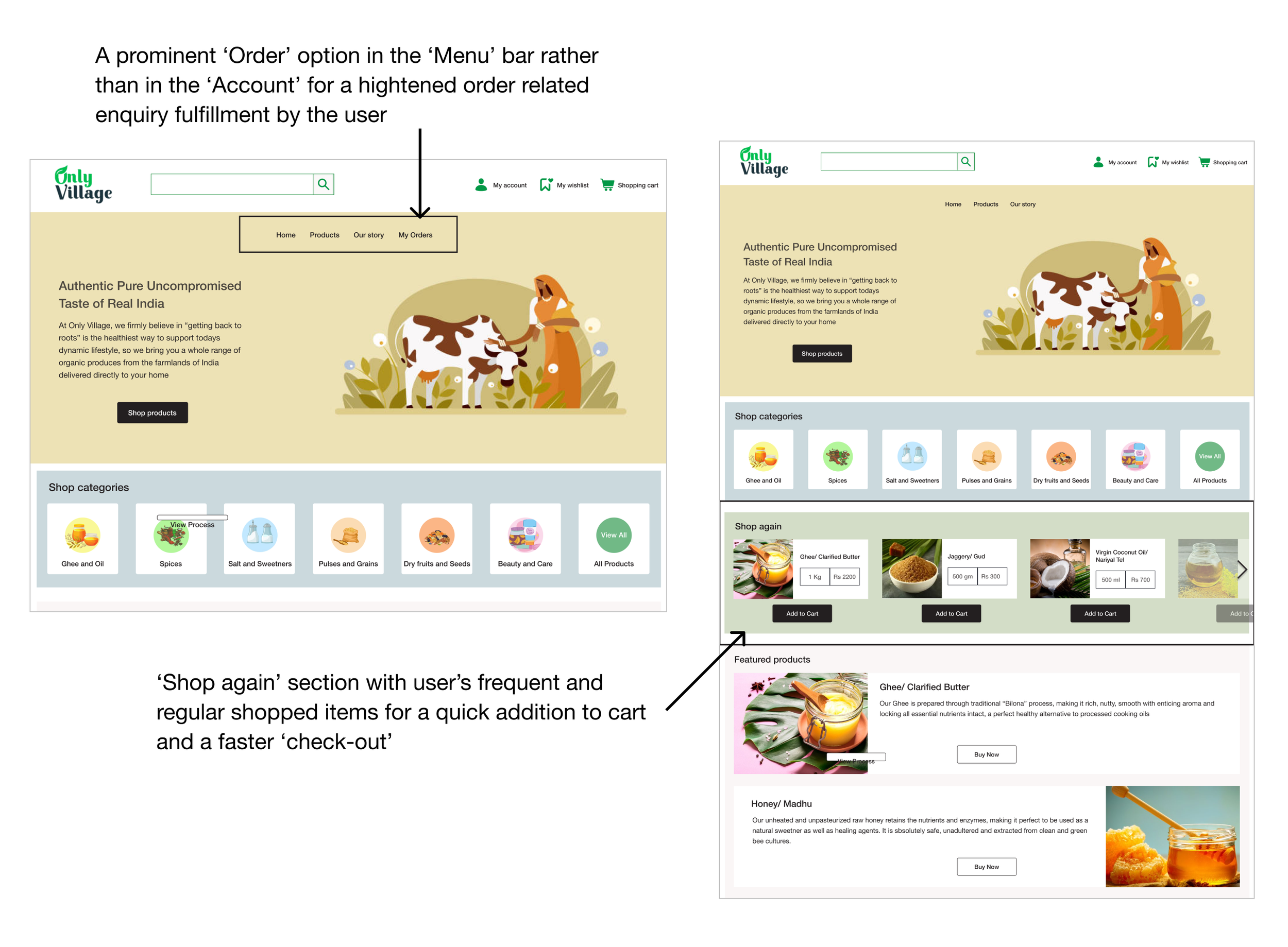
Inclusion of ‘My Orders’ in the Menu Bar for all order related information
Display of most regularly purchased products on the ‘Home’ page for faster cart proceeds.
To enhance functionality and visibility of 'save to wishlist,' A/B testing seems to be the preferential solution to drive appropriate user action through 'benefit of choice.'
The design changes I have incorporated to accommodate A/B testing are following.

Platform: Responsive Web, Desktop, Mobile
Tools: Figma, Principle, Zeplin, Miro, MS Word, Github
Methods: User research- Contextual Enquiry, Interviews, SWOT Analysis
Prototype Build- User Flows, Card Sorting, Wireframes, Hi-fidelity prototypes, Motion, Screen flows
User Testing- Moderated testing, Feedback, Concept Testing, Post-testing Questionnaire